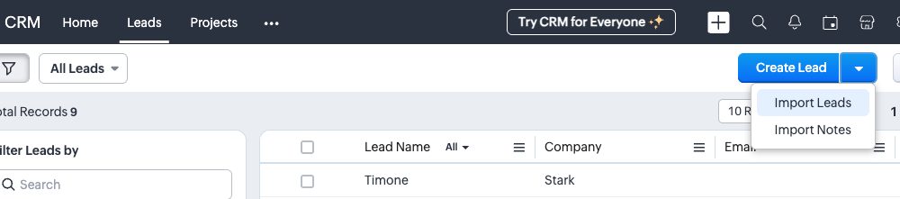
Too Big
This screenshot was taken on a retina display and it takes up too much real estate on the screen. I have to scroll down just to see what the next step is. This should be resized in the editor so that it's smaller.
Too Small
This screenshot is difficult to read.
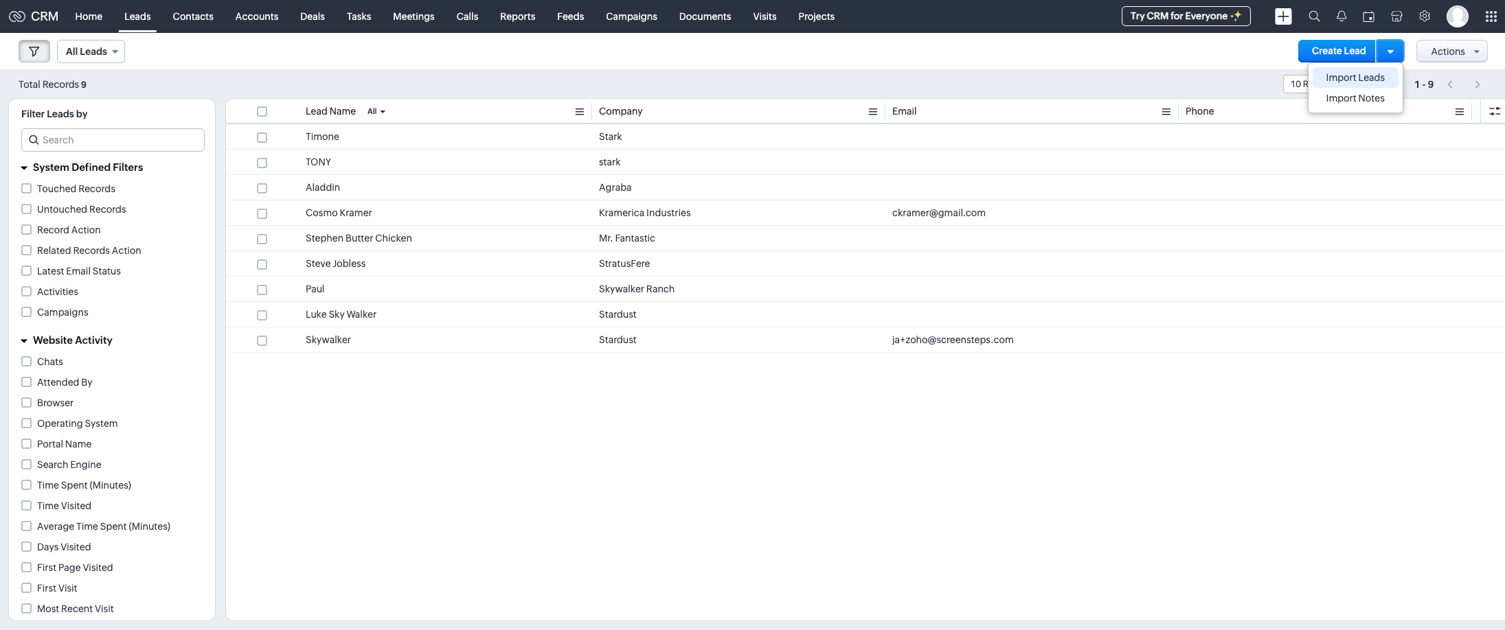
Just Right
This screenshot has a good balance of showing the important part of what needs to be done and isn't taking up a lot of the guide, making it easier on the eyes when scrolling and following instructions.

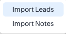
Not Enough Context
It's not clear where this menu is on the screen.
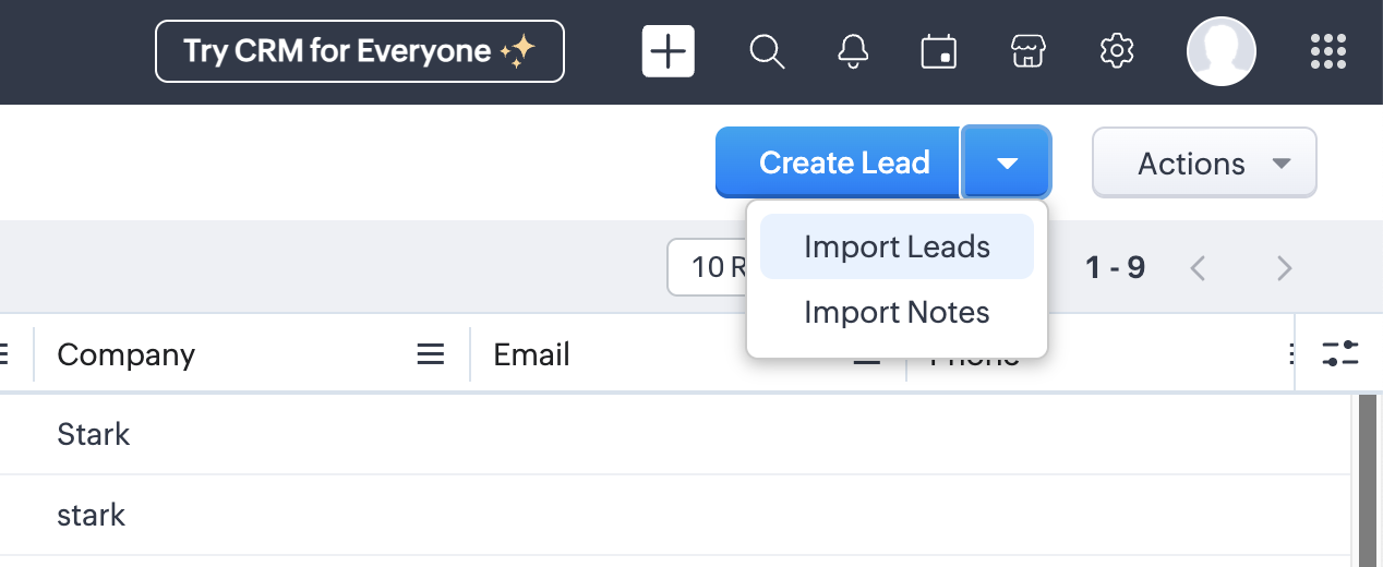
Too much Context
I can see where the menu is, but the screenshot has way more than I need making it difficult to read.
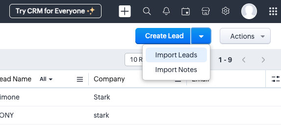
Just Right
This screenshot includes some additional context without overwhelming me. I can clearly see where this action is taking place on the screen.